Measure landing page comprehension with a quick user test
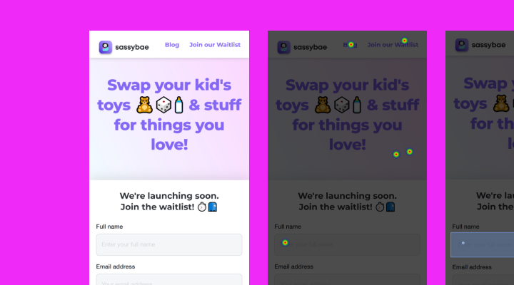
Recently, some friends launched an app for parents of young kids who want to swap toys. I checked out their landing page and it immediately occurred to me that this would make an excellent candidate for a quick comprehension test.
This kind of test is great if you've just designed a landing page, home page or product page. It will give you an idea about what parts of your offering people can understand.
Test setup
There are 2 elements to a comprehension test like this.
- Asking the test participant to look at an image of a homepage, and getting them to answer some basic comprehension questions
- 7-point Likert-scale Single Ease Question (SEQ)
Keeping the test to these two basic elements means that there's less room for testing errors. Also, by using standardised question sets, we can directly compare this landing page to future efforts.
I've been using the 'grunt test' questions made famous by Donald Miller's Storybrand book. It's a straightforward and battle-hardened setup for testing the effectivity of marketing messaging:
Q1: What does this company offer?
Q2: How will this product or service make your life better?
Q3: Where would you tap to buy or take up the offer?
I asked the first 2 questions alongside an image of the homepage, which gives participants every chance to get things correct. But of course, that's not always what happens 🙂
Question 3 is usually 'How would you buy or take up the offer' but as we're using an unmoderated user testing platform (in this case UsabilityHub), I thought a click test with this question would be more appropriate, and give us more interesting data than just a text description.
SEQ ftw
The Single Ease Question (SEQ) is a straightforward way to measure how much effort a potential lead has to 'spend' to understand your company and/or offer.
It's different to a Customer Satisfaction question because you're asking participants to measure the effort they exerted by their own standards.
How hard did I work to find that? Rather than, how satisfied am I about this?
Here's the framing:
Q4: Overall, how difficult or easy did you find this task?
.. with a 7-point scale underneath, starting at 'Very difficult' for 1, and 'Very easy' for 7.
I've come to understand that a 'good' SEQ result is a mean of 5 and above.
Results
I ordered 10 responses from the panel, selecting parents of children as a recruitment attribute. Here we go:
Question 1 – What does this company offer?
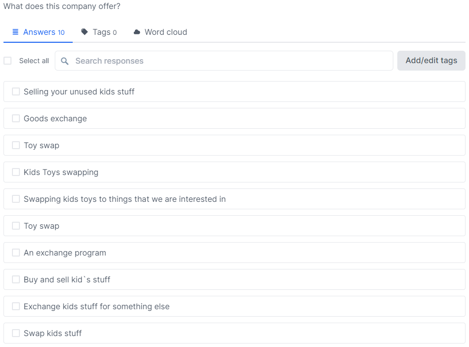
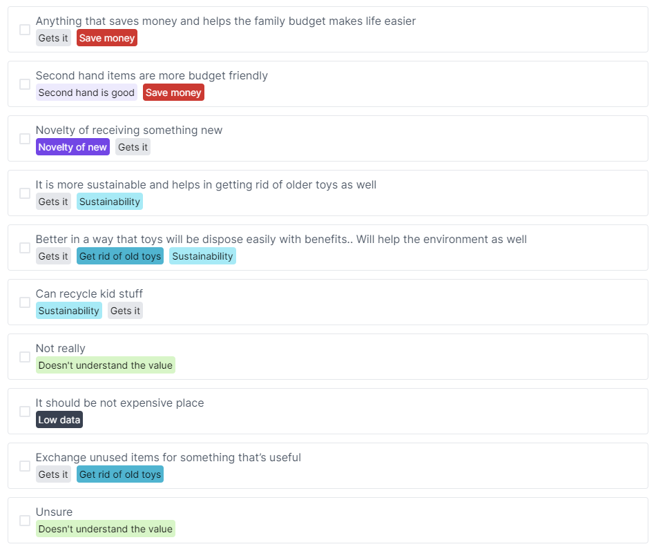
Now that we've got some responses, we can categorise them to try and see patterns in the data.
The categories I'm using here are basic and hinge on the words and sentences that are input by the participants. Here are a few examples:
Gets it - anything that indicates they are at good comprehension level already
Nearly - not there, but in the ballpark
Miss - not there
Swap - mentions the word or concept of swapping toys
Here's the completed categorisation. I don't think too hard about this; knowing the words people use is sometimes interesting enough, as it was in this case.
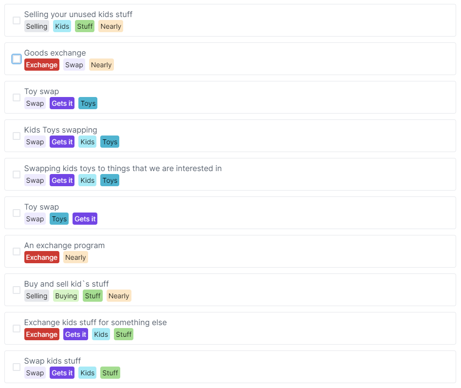
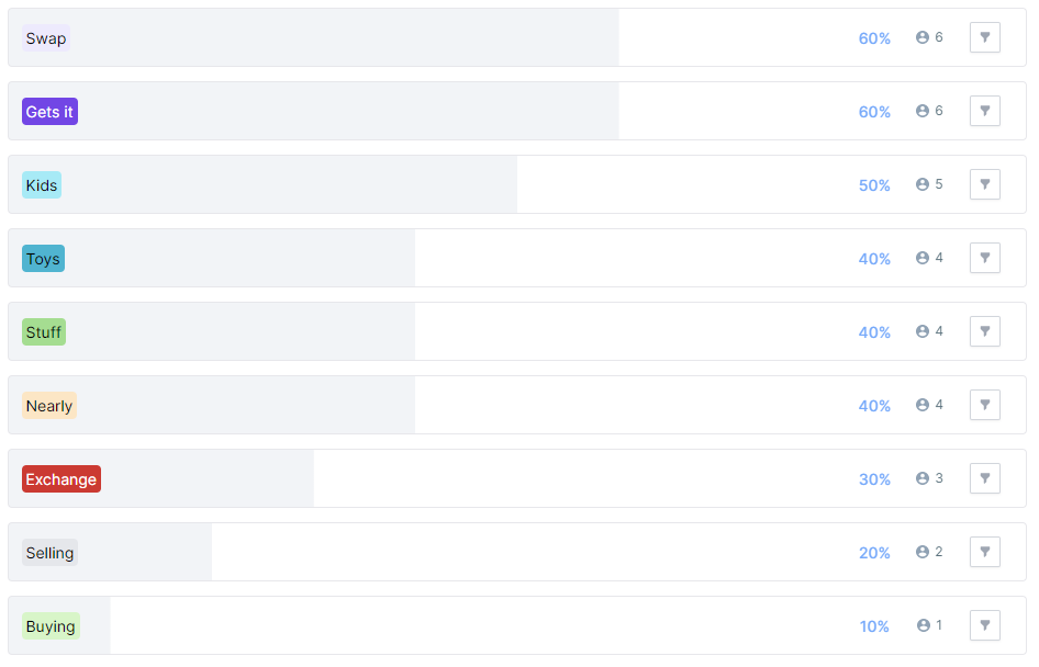
From this view, we can see that 6/10 participants 'get it'. And along with that, the remaining 4/10 are in the ballpark. That's a good result for a test like this in that nobody is bamboozled.
I think this kind of analysis is interesting because the language people use is revealing, considering that one way to consider your brand is 'what people say about you when you're not in the room'.
Result: Good
Question 2 – How will this product or service make your life better?
I used the same technique to categorise responses to the 'value' question:
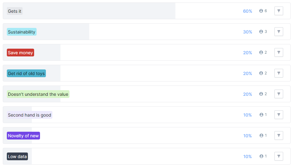
This data confirms that 6/10 participants were able to accurately sum up the value of such a service.
There are some other themes coming through, and it seems like 1 of the remaining 4 participants is close to comprehension, but the other 3 are lagging behind in their understanding of the value of this service.
Result: Okay
Question 3: Where would you tap to buy or take up the offer?
There were several ways that success could be achieved in this task. There are a lot of CTAs on the design, so lots of potential wins.
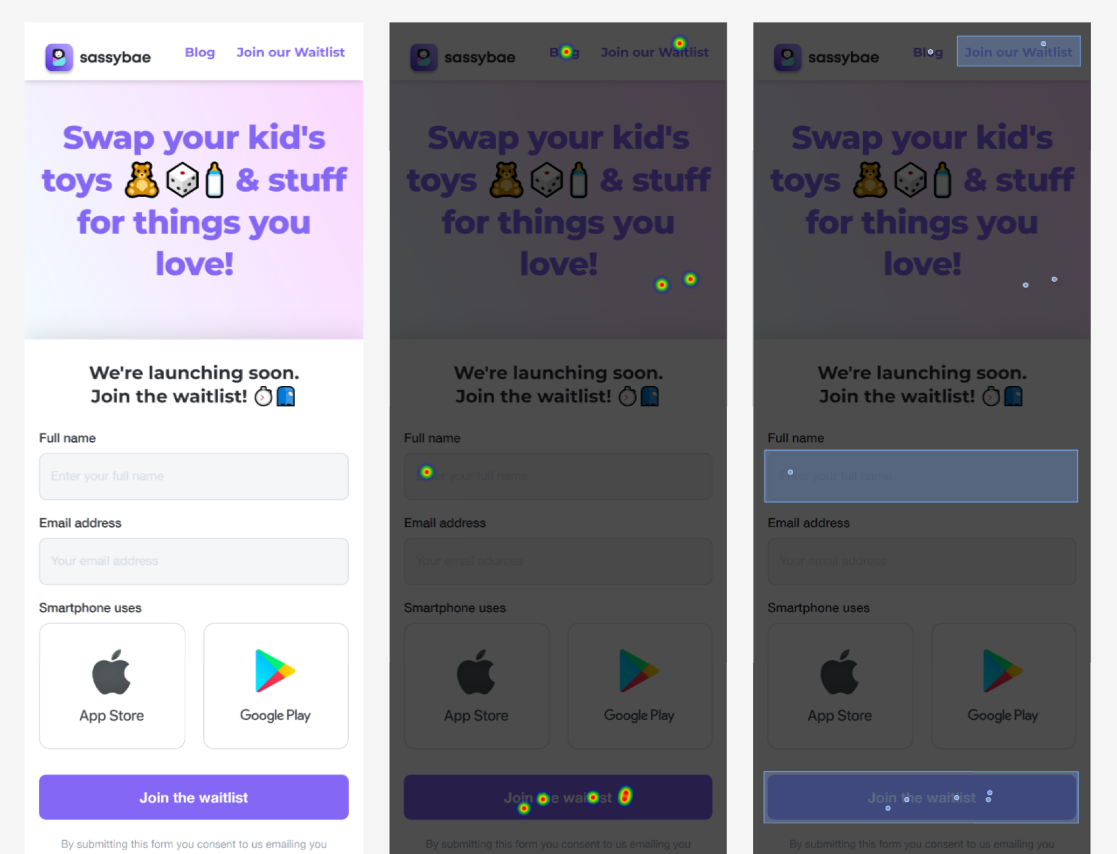
Highlighting the target areas – the button CTAs, text CTA in the header, and input fields – gives us an easy-to-digest visual indication of the success of this design. Here's a breakdown of the clicks:
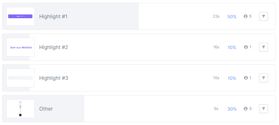
Including all 3 success zones, 7/10 participants would have made it to the next step with their choice.
The clicks on the header are hard to evaluate without further data. Perhaps they thought it was a clickable element.
Clicking on the 'Blog' link is likely to give a participant more information, but doesn't help them directly to take up the offer.
With a task that has a simple goal like this, 7/10 success is an okay result, but not stellar. The design and layout is clearly working for the majority of participants, but there are a few who fall through the cracks.
Result: Okay
Question 4: Overall, how difficult or easy did you find this task?
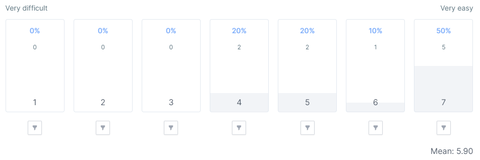
If we just look at the mean number, this is a good SEQ result, remembering that the target for SEQ is a mean of 5 or higher.
However, this shows us why interrogating the data fully and not just looking at the headline numbers is important.
5/10 scored at the maximum level of perceived ease, but there is a spread of responses down to 2 responses at 4 out of 7, the middle of the ease range.
This shows that while again the majority of participants scored highly for ease, there are a group of participants who found this a more difficult task.
Result: Good
Final results tally
Now that we've processed and categorised the data, as well as looking at overall performance in each question, we can gather our results and see where this design lands!
Q1: Good
Q2: Okay
Q3: Okay
Q4: Good
Overall, this gives us an even split between Okay and Good results. Reflecting on Q1 positivity, and the high SEQ mean, I think that's enough to tip us into a 'Good' overall result.
Final thoughts
I'm not sure that quite so many CTAs are necessary for this page. I think I would consider cutting the Apple and Google CTAs, considering they were not big performers in the test.
The designers could strive for something that achieves higher scores when it comes to communicating the value of the service, as that seemed to be the weakest point of the test data.
Apart from those considerations, there aren't any clangers or obvious misses for this design, so my inclination would be to pour some traffic into it, and see how it goes in a real market test.
Join us for more free research!
If you enjoyed this article, I do one of these free user research project writeups every month. Sign up below to join now!