How returning users log in: a free 180-person user research case study

Returning users make up a huge proportion of traffic to sites and products that have customer account functionality.
Are customers of these businesses served with speed and efficiency when they try to log in? Or is a single word or visual treatment sending them the wrong message?
I wanted to find out. I tested 3 design variations of log in action triggers against 3 tasks that would require logging in, with 60 participants each.
This gives us a total participant number of 540, which is a good range for a web UI usability study like this.
A customer not feeling good about an online interaction is a big risk for anyone focusing on engagement.
Some of the insights in this report are not intuitive at all. And it was a fun report to do, because the data proved me wrong – more than once!
Let's get stuck into some data.
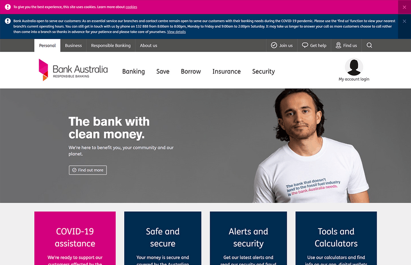
For this report, our test site will be the homepage of Bank Australia, which is a socially-aware bank based in Victoria, Australia.
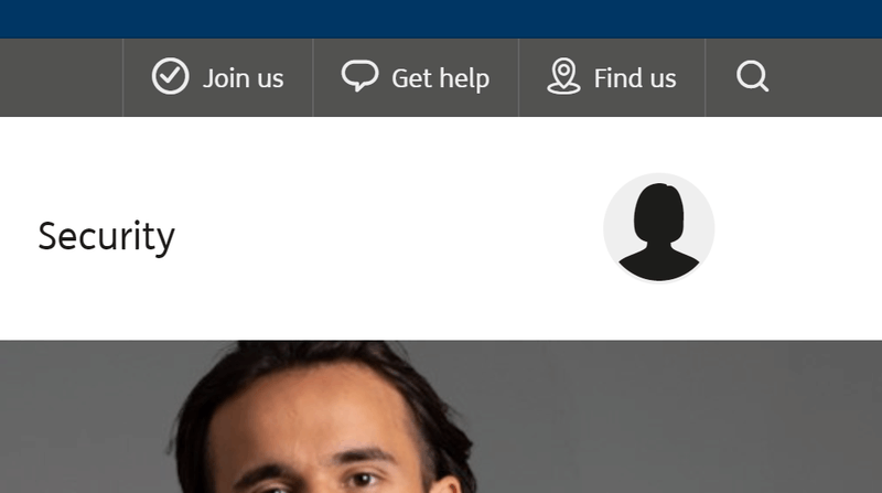
I know plenty of Art Directors and Product Managers who wouldn't cope with the level of UI complexity in this trigger for a simple log in action.
There are "too many words", it "looks clumsy", or "takes focus away from our marketing".
This is understandable feedback. It's not intuitive that the average user would need so much context for a simple log in action.
But let's hold our judgement for a minute, and see what the data says.
Control test
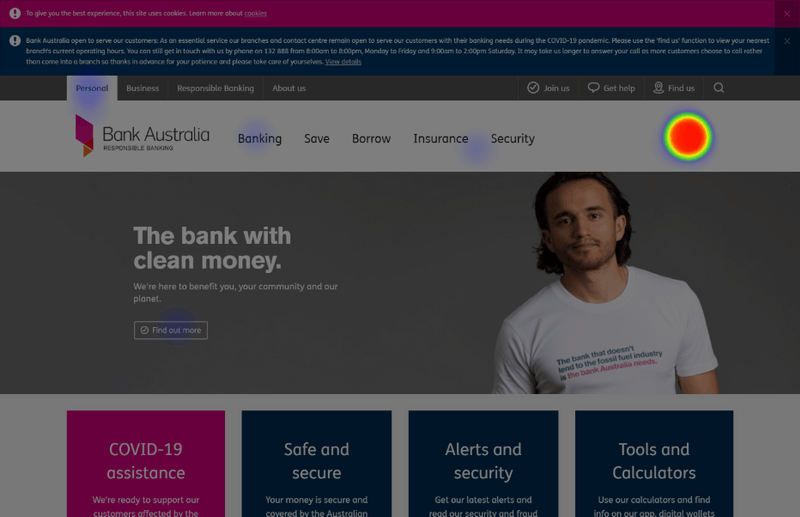
To see how well the initial design performs at helping people log in, I set up a task test on UsabilityHub.
I uploaded the 'Control' variation screenshot (which is just a snap of the existing site above), and set the 60 participants a simple task:
Imagine you are a Bank Australia customer. Where would you click to access your customer profile?
I used this wording so that participants wouldn't be able to scan the page for the exact wording in the task.
Control results
Let's start with a basic success heatmap for the control test.

I've filtered out any responses from current or past customers of Bank Australia, as they have a head start with this task.
There was only a single BankAust customer in this first cohort of 60 participants, so filtered that gives us n=59.
58 of 59 participants completed the task successfully. This is the ideal result for a test like this. Even for simple tasks, there is room for customer error, or bot noise. So this is a gratifying result for Bank Australia, if nothing else.
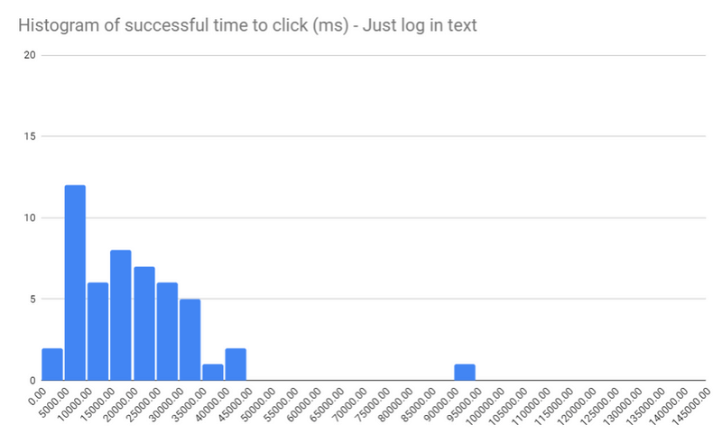
I made a histogram of the successful clicks, which reveals more good news.
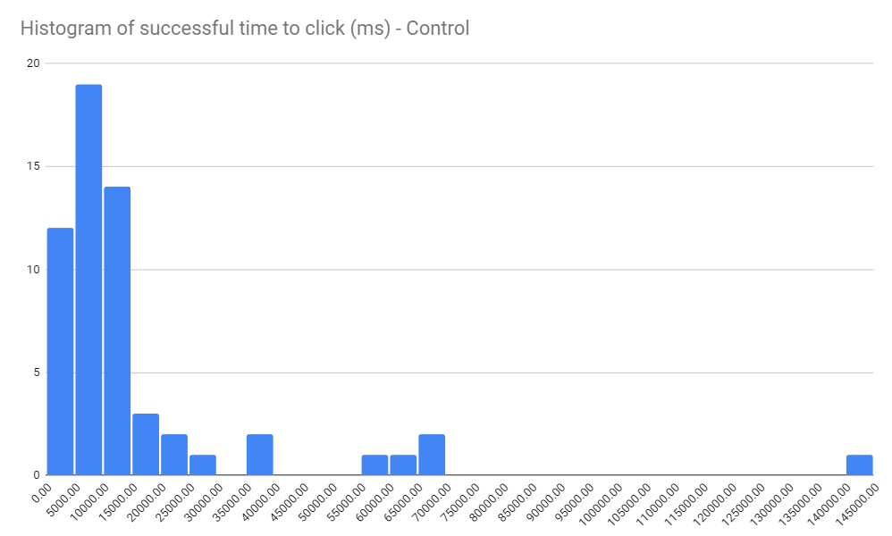
If you're not familiar with them, histograms show the spread of time-based data in a set. Each column (or "bucket") shows the number of users who completed the task at the time intervals along the x axis.
So in this test, there were:
- 12 participants who completed the task in under 5 seconds
- 19 participants who completed the task in 5-10 seconds
- 14 participants who completed the task in 10-15 seconds
...which counts as a really quick set of results. In total, 45 participants succeeded in less than 15 seconds.
There are definitely outliers, with one participant taking upwards of 2 minutes to finish the task.
With this kind of test, there's always variation in the speed that participants complete tasks.
At this scale, time-to-click alone is not a great quantitative measure because it's difficult to objectively determine the complexity of the task.
There might also be other factors – distraction, technology issues, an unclear task, and so on.
Despite this, I think it's useful to compare time-to-click data between different test variations in a qualitative fashion, i.e. getting a feel for the shape of the responses, and using that in conjunction with success rate, as well as a 'soft' metric – in this case, a Single Ease Question (SEQ).
This spread of metrics helps paint a full picture of the performance of each design variation.
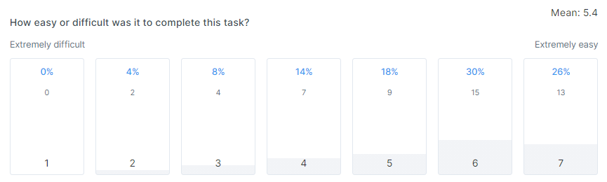
Here's the SEQ responses for the Control test:
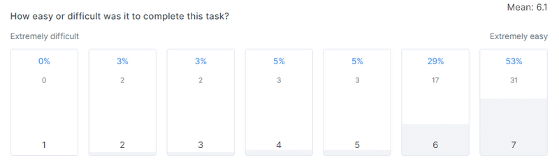
For the uninitiated, SEQ is a measurement of how hard or easy the task was for a participant.
As you can see, it's subjective, as it asks about how the participant perceived the difficulty or ease of the task. This means that the data is interesting from an attitudinal standpoint, as the customer is reporting this data themselves.
Similar to the time-to-click histogram, we're looking at these SEQ results to see the shape of the response spread.
Here, with the high number of 6 and 7 responses towards the 'Extremely easy' end of the scale, it looks like a positive result.
In summary, a good performance from the control
The 98% success rate, healthy time-to-click histogram shape, and attractive grouping of SEQ scores show that the control variation works well in this test setting.
Now it's time to throw a design variation in, and see if it works just as well.
A simple, text-only variation
The next variant is a much simpler treatment of the log in trigger: a single text element that says simply "Log in", replacing the avatar and longer text.
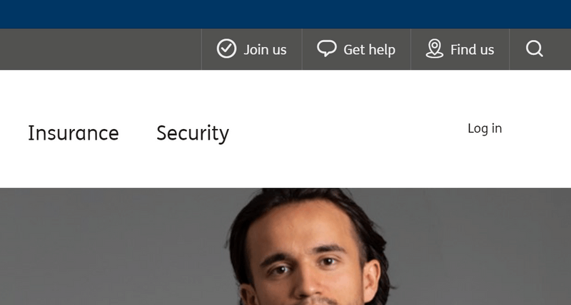
I ran this text-only variation with exactly the same test setup as the control, changing only the image used.
2 of the 60 participants in this test were BankAust customers, leaving us with n=58.
The successful click rate held fairly steady, with only a small drop to 50/58 participants or an 86% success rate. There's some noise from bots in the results, so this is still a good result.
The time-to-click histogram tells a slightly different story:
There are not nearly as many results to the left of the graph compared to the Control test.
The Control had 45 sub-15-second results, whereas this variation with just basic text has only 20.
This is not a reliable number from a statistical standpoint, and I would never make critical decisions based only on this metric.
But it's curious that this treatment would slow people down, even if only slightly.
What if this is a statistical anomaly? Given that we're not testing with 600 or 6,000 participants per test, we can't say for sure that this is a worse performance on time-to-click alone.
That's where the SEQ comes in – it's a great sanity check to any more fuzzy metrics you might be collecting. Here's SEQ for the text-only variant:
This graph isn't as nice as the Control SEQ results, which were very heavy on 6 and 7 results, indicating extreme levels of ease. Here, there's a slight spread of results to the 'neutral' middle of the graph.
It's results like this that make me grateful to have something soft like SEQ in each test, alongside the more cold time-to-click data.
You could forgive the text-only version a slightly worse success rate, and a chunkier histogram in the 15-30 sec results range.
But adding in this customer sentiment result, the results are becoming a bit more clear. This variation seems to perform slightly worse than the Control.
An avatar-only variation
In my opinion, leaving the text off entirely would be too much. And there are questions about accessibility that would have to be answered before moving forward.
But that's the whole point of this kind of experimentation – to see if your gut intuition is correct, and to hopefully expand your knowledge, regardless of your personal opinion for a particular design variation.
Nobody in this third cohort was a Bank Australia customer. So with low expectations (personally), here's the heatmap of all 60 participant clicks:
You're looking at a 90% successful click rate – 54/60 participants got it right.
To me, this seems crazy, but let's not get carried away just yet. What about time-to-click for these 54 successful people?
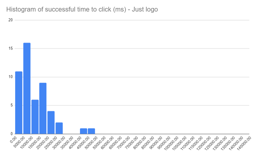
This is a great result, in the same league as the Control test. I'm shocked.
I was certain that taking the text off the log in trigger element would make it harder for participants to find the correct answer. But here we are!
Let's check the SEQ to make sure we're not infuriating people with this new variant:
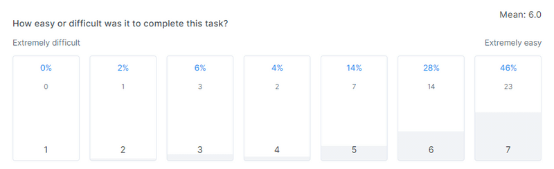
No! We're NOT infuriating people. It's only marginally worse than the Control test.
There are still a couple of numbers down the 'difficult' end of the scale, so it's clearly not a win for everyone.
But that was also true in the Control test – a similar number of responses were below the 'neutral' middle line.
I'm still shocked by the great performance by the avatar-only version. But also, it makes sense.
It's such a strong pattern to have this kind of trigger at the top right of the screen (for native-English web properties, anyway).
So maybe how we treat this log in action trigger, at least visually, doesn't matter for this user task?
That sounds nuts. I'll be following this research up with another article about testing these designs with different user tasks, because honestly, I just can't believe that it wouldn't have any difference.
Join us for more free research!
If you enjoyed this article, I do one of these free user research project writeups every month. Sign up now to join the community!